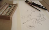
In Poland there is a competition this year that in translation would be called “A friendly book for children”. It is a competition for authors and illustrators but also publisher houses. It is announced by The Museum of Toys in Katowice. I’m still not sure about the details but once I get to know them I will write more about it. One thing is for sure, I will try myself. As Robert Ball said it is important to show your work as much as you can.
Author Archives: martagrabowska
Focus on… Iwona Chmielewska
She finished Graphic Design on UMK in Poland. She lives and works in Torun, where she also works as a lecturer at the Academy of Fine Arts. She mostly creates picture books most of them is published in South Korea but also in Spain, China, Taiwan, Japan and Portugal. She is a winner of many awards. The most important are the Golden Apple on the Biennale in Bratislava and the Bologna Ragazzi Award in Non fiction category.


Publishing Houses in Poland
In a month time I’m going back to Poland. I looking forward to take my chance and try to make it as a children’s illustrator. The children’s book industry is not that much developed as in the UK. But we catch up and characterize with original composition, outstanding images and playing with typography. These are some of the publishing houses I respect the most and hopefully one day I could call one of them my employer:
- Ladne halo http://www.ladne-halo.pl/
- Wydawnictwo Format http://www.wformat.com/
- Wydawnoctwo Tatarak http://tatarak.com/pl/1-home
- Wydawnictwo Czerwony Konik http://www.czerwonykonik.pl/s/ksiazki
- Wyadwnictwo Dwie Siostry http://www.wydawnictwodwiesiostry.pl/
- Wydawnictwo Buka
THE SPLENDOUR OF TEXTILES, Zachęta
In Warsaw I have visited The National Gallery of art called Zachęta.

“Zachęta’s” basic tasks are:
1) the preparation of a programme for the promotion of contemporary art;
2) the exchanging of exhibitions and collaborating with other art galleries;
3) the production of publications in the field of the fine arts;
4) the collection and making available of documentation and information on contemporary art;
5) the realisation of education activities;
6) the collection, inventory and preservation of works of contemporary art;
7) collaboration with cultural institutions and associations active in the field of the fine arts and other social organisations;
8) artistic advice and provision of services in the field of exhibition production and education activities.
Director of the gallery- Hanna Wróblewska
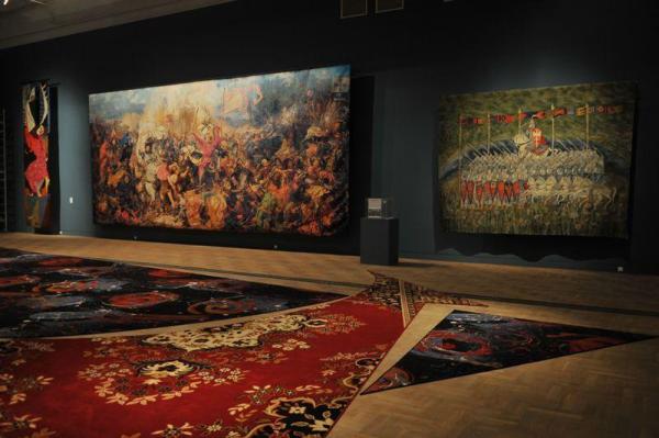
THE SPLENDOUR OF TEXTILES

With a few exceptions, the exhibition encompasses works of Polish artists made from the second half of the 1940s up until the present. The art of textiles is considered both from the perspective of the newest artistic practices, as well as in a historical context, as for example in the case of the “Polish textile school.” The project shows the conceptual and communicational potential of the medium, able to convey clear historical, propaganda, critical, religious and patriotic messages.
You enter to the gallery through a curtain. It protects against the cold, but it smells really bad as well. That’s because it is made out of clothing witch Franciszek Orłowski has exchanged with homeless people. The stairs are covered with a carpet which is made by Leon Tarasewicz, and makes the impression of a cloudy sky.
Normally by the entrance to the first floor there is a sculpture of a Gladiator. But for the time of the exhibition it has been exchanged for a woman dummy, dressed by Anna Nawrot In ties for men, which the artist buys In second hands. The exhibition aim is to restore the fabric to art. It reminds that it Has experience the same adventures In Polish history as well as painting or sculpture.
The piece I Lidek Best, and which made the most impression on me was Aneta Grzeszykowska’s work. She made a fabric made out of Velcro plant. I made me think about how amazing the results can be if you just opened your mind to the things that surround us every day, and you normally do not see.


Tate Liverpool
On the 28th of March I was going back to Poland for Easter. My plane was taking of from Liverpool in the afternoon. Then I decided to leave Wrexham early morning in order to visit Tate Modern in Liverpool. I Was really looking forward too see it, encouraged by the fact that its the second biggest Museum of Modern Art in Britain after Tate Modern in London. As I’ve been to the London branch quite recently, and got knocked down on my knees by it, I had really hight expectations from the Liverpool squad.
The gallery opened in 1988 and is housed in a converted warehouse within the Albert Dock on Liverpool’s waterfront. As I’ve visited the place on Thursday at noon the gallery was almost empty, so took a tour in peace and quiet.
GLAM! The performance of style

“Glam, a visually extravagant pop style exploded across Britain during the years 1971–5. The exciting, futuristic sounds, extravagant fashions and glitter-dappled personas emerging in this era had their roots firmly in British art schools”
My first association with glam is David Bowie, sexual freedom and men with strong make up, dressed in a distinctive way. The exhibition reveals the style and shows how big was it’s impact to all fields of art, bringing together more than 100 pieces.
Pink walls, glitter and sparkles, David Bowie music. They all make a reliable background. Because Glam is more than a visual style. It may be understood as an attitude or state of mind.
Words which i think represents the style best are:
- self awareness
- self-identity
- art infused lifestyle
- masquerade
- personal transformation
- refined dandyism
- artifice and eroticism
- hedonism
- amplified vision
- extravagance,
- experimentation
- exhibitionism
The exhibition has presented great names like Andy Warhol, Richard Hamilton, Allen Johnes and many many other. The works of Sigmar Polke’s, David Hockney and Patrick Proctor I liked best. But the the biggest kick out I explored on the show was the diverse typography which appeared on magazine covers, posters, vinyl jackets and other illustrations or publications. Also photos of Jimmy De Sana of -which I have never heard before -affected me the most. 

I find Glam! exhibition as a cool experience. The early 70’s challenge to what could be considered as fine arts, gave people freedom of life and of choice. It was a complete breakthrough. Glam inspires now and will inspire next generations as well.
Sylvia Sleig
Sylvia Sleigh born in 916 (died in 2010) was a Welsh-born naturalised American realist painter.

“I feel that my paintings stress the equality of men & women (women & men). To me, women were often portrayed as sex objects in humiliating poses. I wanted to give my perspective. I liked to portray both man and woman as intelligent and thoughtful people with dignity and humanism that emphasized love and joy”.

The thing that catch the eye in her paintings are detailed and rich patterns. She thoughtfully selects colours which I actually find a bit faded. Based on what I’ve seen in Tate I also have an impression that she overdraws the faces of people she is painting. But despite that, I think of her work as surprising, but not that impressing.


Making Stop Motion Films on a Tiny Budget- Linda McCarthy
She is the creator of Tiny Elephants animation company, specialised in animated films in stop motion. She is the creator of cartoon strips Small Birds Singing.

What have I leart from the lecture?
- The patience and effort you have to put to make a short stop motion clip
- how does the set look like creating a stop motion animation, and tricks and tips how to make a illusion of space
- the precision and importance of detail while creating the actors and the set. It made a great impression on me when Linda showed us how she made little tea pots and over ceramic vessels by her self, and ow beautiful they looked on the set.

- how to create a stop motion puppet, by making a frame of the body which gives the opportunity to move individual parts of the body, creating ceramic heads with every single face look the actor will present and clothing.
- How expensive is this industry!!!!!!!!!!!!!!!!!!!!

Design and Illustration in Illustrated Publishing- Yasia Williams Leedham
Yasia Williams presented the publishing industry and what to expect from it. She works in Octopus Publishing Group.
What have I learnt from her lecture?
- The importance of imprints. Big publishing houses are divided into departments with various genres/categories of interest. They often have their own trademark, even though they come from the same family.
- The design of the book helps to promote the content and personality of the people it is created for. When it comes to jacket design we have to remember that it has the biggest impact on the audience. A lot of people refer to visual effect in a book store. It’s your job to make sure the book your working on is distinguished from many others.
- A lot of books nowadays are sold on the internet. It is important to account it while designing the cover of the book. On the website they show only a miniature of the jacket, and no matter how it is awesome in normal size- if its illegible, nobody will give interest in it.
HOW NOT TO BE A DESIGNER by Robert Ball
On Monday (4th March) Robert Ball came to visit students from Glyndwr University. He works in one of the biggest design company in the UK. He says that branding is all about appropriate work for appropriate people.
What I have learnt from Robert Ball
- how not to promote a gallery based on the National Gallery campaign, school folders, a screensaver for a bank
don’t make a poster with a piece of art work just because is is well known. It doesn’t tell anything about the gallery, and if somebody doesn’t like the piece- your lost. Find a solution that will be less obvious, look deeper and try to find the real problem your trying solve and thing of the way to promote it.
- How to write a CV
the fist thing I have to remeber while creating my CV is that nobody will read it. Most importably it has to be simple. It shouldnt contain files that will be loading to long, because nobody has the time to wait. Sketches are not desirable. And remeber to keep my CV clean! Robert Ball also suggests to put on the beggining the second best piece of art work you want to show, in the middle the ones you think are ok, and leave the best art work to the end
- how to talk with a client
While talking to a client, and thinking about the project do not consider the task as a picture, but as a problem that your trying to solve. To be honest thats what the client wants by the end of the day.
Roberts Blog http://robertmball.wordpress.com/
Being a children’s book illustrator- Kristeen Harris Johnes
On Tuesday ( 5th March) a freelance illustrator came to tell us about how her work looks like. She studied at The North Wales School of Art and Design.


What have I learnt about being a children’s book illustrator?
- If you want to be a freelance illustrator you have to find a manager who you could trust completely.
- make a organised studio. Keep all your work together.
- Make your work bigger than you need. For exampled A3 artwork is easier to scale down if needed without loosing the quality.
- Even though nowadays we can find everything on the internet, at some point all reference folders will come back to be useful, so keep them organized as well
- Think of what kind of stories you want to do and stick to it
- When you get a job, and they send you the brief it is good to make notes on the emails. It is important to talk through the things you don’t understand so it is clear to both sides what to expect.
- If the client requires something that is just physically impossible for you to do, suggest your own interpretation writing to the client why you did it that way. Most times the client agrees to it.
- Talk through any alterations so it is clear to both sides. Don’t be afraid to negotiate if needed.
- Do not take the feedback personally Work is often sent back with lots of crosses, circles and notes. It’s just something you have to get used to
- It is possible that the deadline may change, so be aware that late nights come with the territory of most briefs, if not all.
- While creating a image you must remember about the typography that comes along with it.
- After publishing your art work remember to register for PLR or ALACS to gain income from library borrowings.
Creative Futures at Glyndwr University
4-7 March 2013
This four day event brought by Glyndwr University (Wrexham,North Wales) collected people working in the creative industries. The aim of the program was:
- to provide students with an insight into the realities of working in the creative industries.
- to provide an opportunity to meet and network with industry professionals to help develop their future career.
- to meet the requirements of students academic studies.
Glyndwr Univesity expected students to reflect on their own possition, think about potential gaps in their skills or knowledge, challenge themselves and also coming up with new ideas.
